Visualizing Statistics: My Handwritten Notes on Variance & Outliers
Welcome to the lab. 🧪
Sometimes, looking at typed formulas on a screen feels too abstract. To truly understand concepts like Variance or Outlier Detection, I have to turn off the computer, grab my tablet, and scribble them down manually.
This week, I revisited the core pillars of data distribution. Here are my raw field notes.
1. The Battle of Variances: Biased vs. Unbiased
When I first learned variance, I was confused. Why do we sometimes divide by n and sometimes by n-1?
I drew this out to make it stick:
My Key Takeaways:
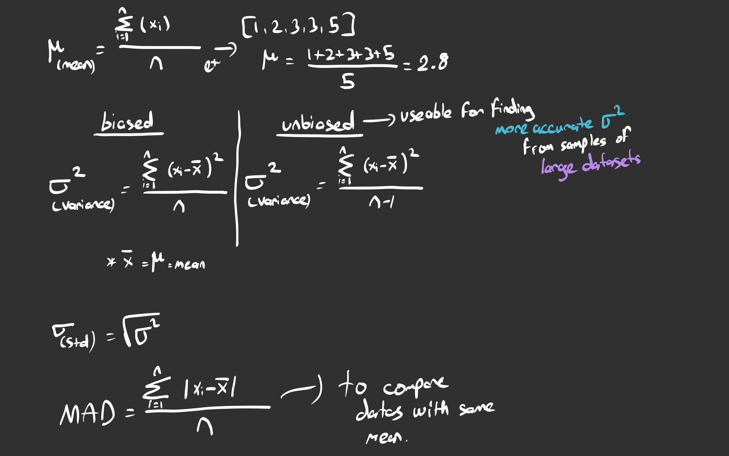
- The Mean (μ): This is just the center of gravity. In my example
[1, 2, 3, 3, 5], the mean sits at 2.8. - Biased Variance (Dividing by n): This assumes we have data for the entire population.
- Unbiased Variance (Dividing by n-1): This is the crucial part for Data Science. Since we usually work with samples (small chunks of big data), dividing by n underestimates the error. Dividing by n-1 corrects this bias.
- Note to self: Always check if I’m working with a sample or the full population before writing the code!
- MAD: As noted at the bottom, Mean Absolute Deviation is great for comparing datasets with the same mean, but Variance is mathematically more potent.
2. Spotting the Anomalies: The Box Plot
In any experiment (or when tracking my own bio-data), anomalies happen. A sensor glitches, or I have a surprisingly bad sleep score. How do we scientifically decide what is “normal” and what is an “outlier”?
Enter the Box Plot and the 1.5 IQR Rule.
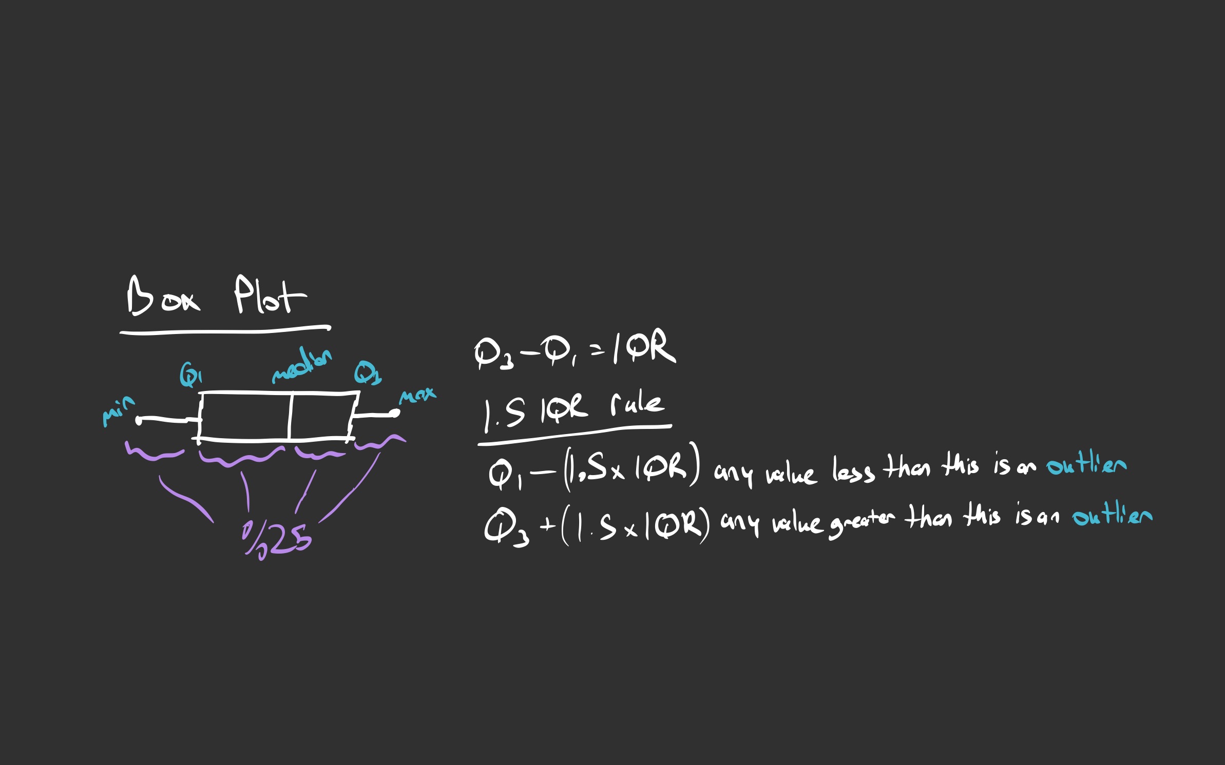
The Logic:
- The Box: Represents the middle 50% of the data.
- IQR (Interquartile Range): The distance between Q3 (75th percentile) and Q1 (25th percentile).
- The Whisker Limits:
- The “safe zone” ends at 1.5 x IQR.
- Anything beyond the whiskers (the purple lines in my sketch) is officially an Outlier.
Conclusion
Writing these down by hand helped me visualize the “geometry” of data.
- Variance is about the spread (squared).
- Box Plots are about the boundaries.
Next time you see a complicated formula, try drawing it. It changes everything.


